

June 1, 2020
New Map Shows Hundreds of Counties in the COVID-19 Endgame — and Thousands on the Uptick

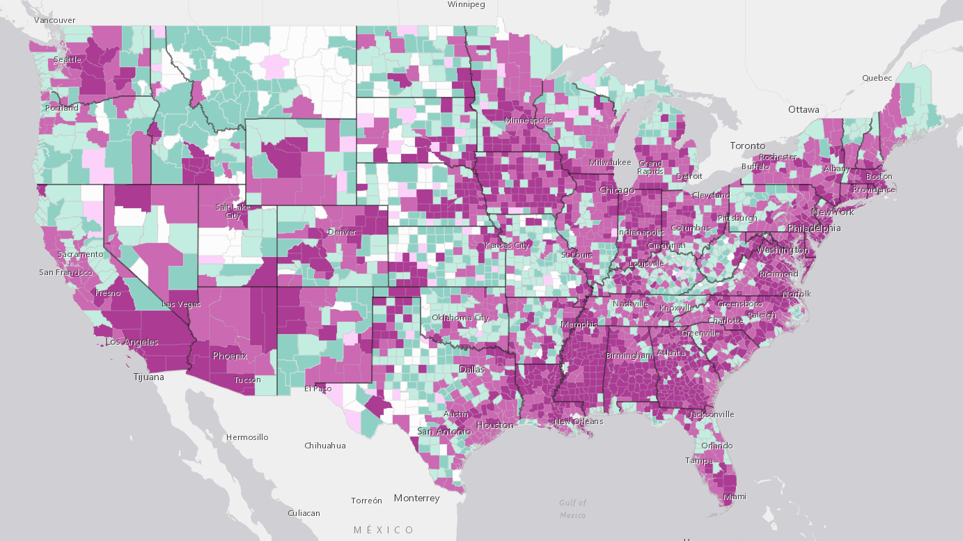
Esri's COVID-19 Trends for U.S. Counties tool. Light purple counties are emergent; medium purple counties are spreading; dark purple counties are in the epidemic stage; light green counties are controlled; and dark green counties are in the end stage.
As more and more states around the country begin to loosen the lockdowns that have kept most Americans inside for upwards of two months, people are waiting with bated breath for the dreaded second peak that some researchers say is looming on the horizon. Data analysts have been furiously poring over the numbers on a variety of levels, trying to identify the most telling signs of continued ebbing in COVID-19 cases – or their resurgence – in various areas. Now, a new tool from geographic information system firm Esri allows people to easily understand which way COVID-19 cases are trending in their own counties.
The tool (called COVID-19 Trends for U.S. Counties) uses data collected by the Center for Systems Science and Engineering (CSSE) and Johns Hopkins University (Johns Hopkins also uses this data for their own county-level case dashboard, which focuses on the raw numbers of cases and deaths rather than trends).
The dashboard considers areas where there are at least ten days of case data and classifies counties based on their total population, total number of cases, number of cases per capita, and number of new cases per day. Counties are split into five categories:
- Emergent: Early stages of outbreak, defined as fewer than ten cases and a mean of recent new cases per day between 33% and 50% of existing cases. There are currently 59 counties in this stage.
- Spreading: Early stages and, according to Esri (and depending on an administrative area’s capacity), this may represent a manageable rate of spread. “Spreading” is defined as more than ten cases and a mean of recent new cases per day between 33% and 50% of existing cases, among other criteria. Esri reports that there are currently 908 counties in this stage.
- Epidemic: Uncontrolled spread, defined by more than ten cases, a mean of recent new cases per day over 33% and a rate of active cases over two per 100,000 residents. Esri reports that there are currently 956 counties in this stage.
- Controlled: Very low levels of new cases, defined by a 21-day streak of new cases being under 0.5 per 100,000, a low mean of new cases per day and at least 63 total days of cases. Esri reports that here are currently 629 counties in this stage.
- End Stage: No new cases, defined by an average of less than one new case every five days for 42 days. There are currently 411 counties in this stage.
In addition, there are 179 counties with zero confirmed cases.
Esri’s COVID-19 Trends for U.S. Counties tool. Light purple counties are emergent; medium purple counties are spreading; dark purple counties are in the epidemic stage; light green counties are controlled; and dark green counties are in the end stage.
To see where your county stands in the trends, visit Esri’s tool here. Esri has also helped to create a number of other COVID-19 maps, including dashboards tracking travel restrictions, testing, and more.
Leading Solution Providers


Tabor Network
Sponsored Multimedia


Featured Events
-
AI & Big Data Expo North America 2024
 June 5 - June 6Santa Clara CA United States
 -
CDAO Canada Public Sector 2024
 June 18 - June 19
 -
AI Hardware & Edge AI Summit Europe
 June 18 - June 19London United Kingdom
 -
AI Hardware & Edge AI Summit 2024
 September 10 - September 12San Jose CA United States
 -
CDAO Government 2024
 September 18 - September 19Washington DC United States