COVID-19 Has a Data Governance Problem

(Khakimullin Aleksandr/Shutterstock)
The COVID-19 pandemic has put many of the world’s activities at a stand-still. Scientists and government officials have been working furiously behind the scenes to forecast the spread and growth of the virus since the first observed cases were submitted to the World Health Organization (WHO). As the virus spread from Asia and Europe to the United States, model predictions on the number of infected in the United States was curbed by the number of available tests and the limited testing criteria to critical patients.
In March 2020, with the virus spread looming across the United States, many of the predictive growth trends were modeled after Italy and Spain, whose infection spread started roughly 10-12 days prior to the U.S. Visualizations based on number of cases and time since the first case showed how flattening the curve through social distancing can lower the strain on our medical resources, which led to the popular social media hashtag #flattenthecurve. Today, in addition to predicting the growth and casualties from COVID-19, many reports also count the confirmed and recovered cases gathered from state and national health government offices and local media reports.
Each day brings in a new set of staggering data points on the number of infected and casualties. As a data governance professional, I cannot help but notice the discrepancies and the disparities in the published reports on COVID-19. All the data points to the same root governance questions: How do we enforce proper data governance standards including data quality for responsible data reporting? And how can we in the data community collectively ensure consistent reporting for future global pandemics?
Is Everyone Using the Same Data Standard?
There are different calculations
and standards used to report on COVID-19. This is a very common data governance problem. To address it, there should be an effort to standardize the definitions and calculations used for common concepts. Examples of common COVID-19 concepts include the definition for calculating “confirmed cases” and “active cases.”
The reason is, each data provider (or source) will have different methods for calculating the same concept. In turn, the data consumer (or in this case, the reader) may interpret the data based on their own perceived understanding of the concept. The potential harm here is that different conclusions can be drawn from the same technical analysis if preconceived interpretations are made about the same data concepts.
The public numbers from various sources are based on different definitions and parameters. According to the Johns Hopkins Coronavirus Research Center, the definition of confirmed cases includes presumptive positive cases. This number will vary with other local sources who may not have included presumed positive cases. In addition, Johns Hopkins relies on recovered cases based on local media reports, data that is inconsistent in the sourcing.
In comparison, the New York City Health Department has also reported on positive cases by diagnosis date, hospitalizations by admission date and deaths by date of death. Their use of confirmed cases is based on the count provided by local hospitals in NYC, and admittedly their calculation for confirmed cases changed from the diagnosis date on March 31, 2020. This means that prior to this date, their reported number of cases was based on the report date. The change in the calculation for the number makes it difficult to connect the number of confirmed cases prior and post March 31.
Visualizing the Trends in COVID-19
Data governance problems also arise with how to illustrate and represent the standardized data to the public. There are several techniques that can be used to create a graph to represent the scale of the number of new cases by country. Two common types are a linear scale and a logarithmic scale. When there are numbers that are skewed towards high values, a logarithmic scale is preferable to show the change in rate in the number of new cases over time.
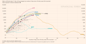
The logarithmic scale is extremely useful in displaying large data, but it may not be understood by all readers. Without the proper labeling in this graph of data, a reader can be misled to believe that this is a linear scale. For example, in the logarithmic scale below of COVID-19 cases by different countries, the large number confirmed cases in the United States can be graphed with the smaller number of confirmed cases in Japan and South Korea.
A linear scale is most often assumed for a line graph since it is the first method learned by students in primary school. It is a simple way to graphically represent the absolute number of cases. However, with the large scale in the number of confirmed cases, this method would not be a feasible way to illustrate the data in one chart.
Another technique used in this same graphical analysis is the rolling average of the daily confirmed cases. A rolling average line smooths out the “noise” that may occur from a one-day spike in cases. Otherwise there would be multiple spikes in the line for the period of time. The moving average line shows the upward directional trend.

Source: Financial Times
When it comes to reporting on trends and measuring growth rates, the use of the line graph using the logarithmic scale and a rolling average are preferable techniques to illustrate the reported global cases by country. Alternate graphical methods such as a bar graph would not be able to demonstrate the rate of change over a period of time. The key takeaway for a data analyst is to provide explanation and transparency to the reader who may not be familiar with your reporting methods. One simple way is by identifying the logarithmic scale when it is used.
The Data Governance Principles We Need
The differing data standards with regard to definitions, calculations and visualizations are creating too many versions of the global pandemic. There is an incomplete view of the magnitude that COVID-19 has had on each state and national level because each data set has a very specific interpretation and methodology for data collection and reporting. In order to stitch together the data sets from various sources, it would be equivalent to adding up apples and oranges together. It just doesn’t make sense.
Without a clear set of established data governance principles, it ultimately makes it hard for government and health officials to get a clear picture of where we are so they can create the best prevention policies forward. We need data governance standards to ensure consistent reporting on COVID-19 so that there are reliable conclusions drawn and actions taken.
To address this, I am advocating for basic principles that everyone needs to consider before publishing their analysis. To do otherwise would be irresponsible and counterproductive to the goal of providing data insight to further the understanding and awareness of the global pandemic.
- Document the key concepts and sources used in your analysis. Wherever possible, remain consistent in the definition and calculations with other publications to avoid readers misinterpreting your analysis. Identify any differences as applicable to help guide the reader.
- Verify the quality of data that is used in the analysis. There are two key dimensions that measure the trust in the data: accuracy, and completeness of the data fit for the purpose. Any limitations in the data collection and completeness needs to be qualified in the report.
- Know how the data was collected. If I relied on a third party to provide data for my analysis, I must understand the steps taken by the third party to collect and secure the data. In other words, I must trust the collection process so that results of my analysis can be trusted as well. The same must be done even during the current pandemic.
- Ensure the findings are reported clearly to the reader. If I choose to visualize my analysis using a logarithmic scale, I would label the graph appropriately. If I were to display the numbers in a tabular format, I would want to make sure the reader comes to the same conclusion that I intended. Providing transparency to the assumptions in the report will help ensure the data governance standards are adhered to.
Data Governance in the Post-Pandemic Future
While it is too early to project when we’ll see the end of the current COVID-19 pandemic, we can certainly — and should — prepare for the next global pandemic. Yes, that’s right, the next global pandemic. We can be better prepared to accurately collect and report on the data that is needed to share with the global community to understand the spread and trend of the virus. While there are social and hygiene lessons learned from COVID-19, the basic principles of data governance have been pushed to the forefront as important lessons to critically follow.
The data community needs to push for standards and transparency in the data sets. We need to create the same definitions for calculating the numbers of confirmed, active and recovered cases. The Centers for Disease Control and Protection (CDC) recently posted a job hiring for a Chief Data Officer whose responsibility includes implementing a data governance program to standardize data structures and to advance the ethical and impactful use of data for discovery, innovation and improvement. This role is critical to establish and enforce the data governance principles for the future, but it won’t come soon enough to address these issues today.
Until then, here’s what you can do today. As a data analyst, think critically about the data that you are using in your analysis and ensure that the data governance principles are being followed. If you think there are issues with the data source, provide transparent explanations to the report. Lastly, work towards filling the data gaps in siloed data sets and refuse to work with data sets that have flawed data quality issues around sourcing. This is a critical moment in history for getting data governance right. The stakes are too high not to.
About the author: Peggy Tsai is the vice president of  data solutions at BigID. She brings over 18 years of practitioner experience in data management, stewardship and governance from the financial services industry. Prior to joining BigID, she was vice president of data and analytics at Morgan Stanley where she helped run the data governance program across the Wealth Management division. Peggy also served as the data innovation lead in the Enterprise Data Management group at AIG, and was responsible for implementing enterprise data management practices to support Anti-Money Laundering, Solvency II and GDPR in the Latin American region and Commercial line of business. Peggy has a Masters in Information Systems from New York University and a Bachelors of Arts in Economics from Cornell University.
Related Items:
How the Lack of Good Data Is Hampering the COVID-19 Response
Coming to Grips with COVID-19’s Data Quality Challenges
Data Transparency: Lessons from COVID-19


