
October 14, 2021
Data Dashboarding Must Evolve or Face Irrelevance
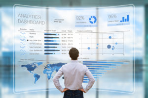
Data visualization has become synonymous with business intelligence (BI) data dashboarding. But these dashboards have a weakness: They are only as good as the humans–and AI–that interpret it.
For businesses to truly unlock their full operational efficiency potential, they must find a better way to translate data, operationalize metadata, and create more visually intuitive ways to build trust and extract value from the data.
Dashboards Lack Context and Collaboration
One of the reasons behind the lack of trust in the data stems from the absence of context around the numbers to make them useful, especially if the data is needed for a range of purposes, viewed by more than the dashboard creator.
And more often than not, when the data isn’t our own, we tend to distrust it. Even if we somehow did manage to get the necessary information to generate greater trust in these numbers, the dashboard itself lacks the power and flexibility to do the bespoke analysis required for our purpose. Sound familiar?
Data dashboards have been successful in getting people to do something with data, but that doesn’t mean that that something is a meaningful use of the data. Dashboards have served as a means of data empowerment, but they are not necessarily the optimal interface for data collaboration — an essential component of just about all successful AI project deliveries.

(Pasuwan/Shutterstock)
One way to move beyond a data dashboard way of thinking is to pair charting data with other data visualization techniques to include context to the data displayed. This can help bridge the gap between data managers and business users, enabling improved data literacy, accelerated digitalization, and more informed data-driven decisions.
These additive data visualization techniques could be in the form of geospatial contextualization with maps and 3D (CAD, lidar, photogrammetry), process contextualization (engineering documents), data notebooks (advanced analytics) – or even the combination of all in the form of digital twins.
What Will Replace Dashboards?
Gartner asserts that data dashboards are too limited and on their way to becoming a thing of the past. Its analysts assert that these dashboards could be replaced by something called “personalized data stories,” which is a way of providing the most relevant insights to users.
These insights or stories are streamed directly to individuals, offering rich contextual relevance, accompanied by a set of prescriptive actions. This marks a move towards more active AI assistants rather than passive BI dashboards. To deliver personalized data stories, the primary data needs to be accompanied by rich data context.
Are Data Notebooks the Right Choice for Dashboarding 2.0?
When looking for alternatives beyond data stories, data notebooks, such as Jupyter, emerge as a popular option, having made their mark over the last few years in the data science field. The process-oriented nature of data notebooks has proven superior to traditional BI scripting for data science work. Some of the main advantages of data notebooks are the fact that everyone can see the code and its author’s commentary, which builds trust in the process.
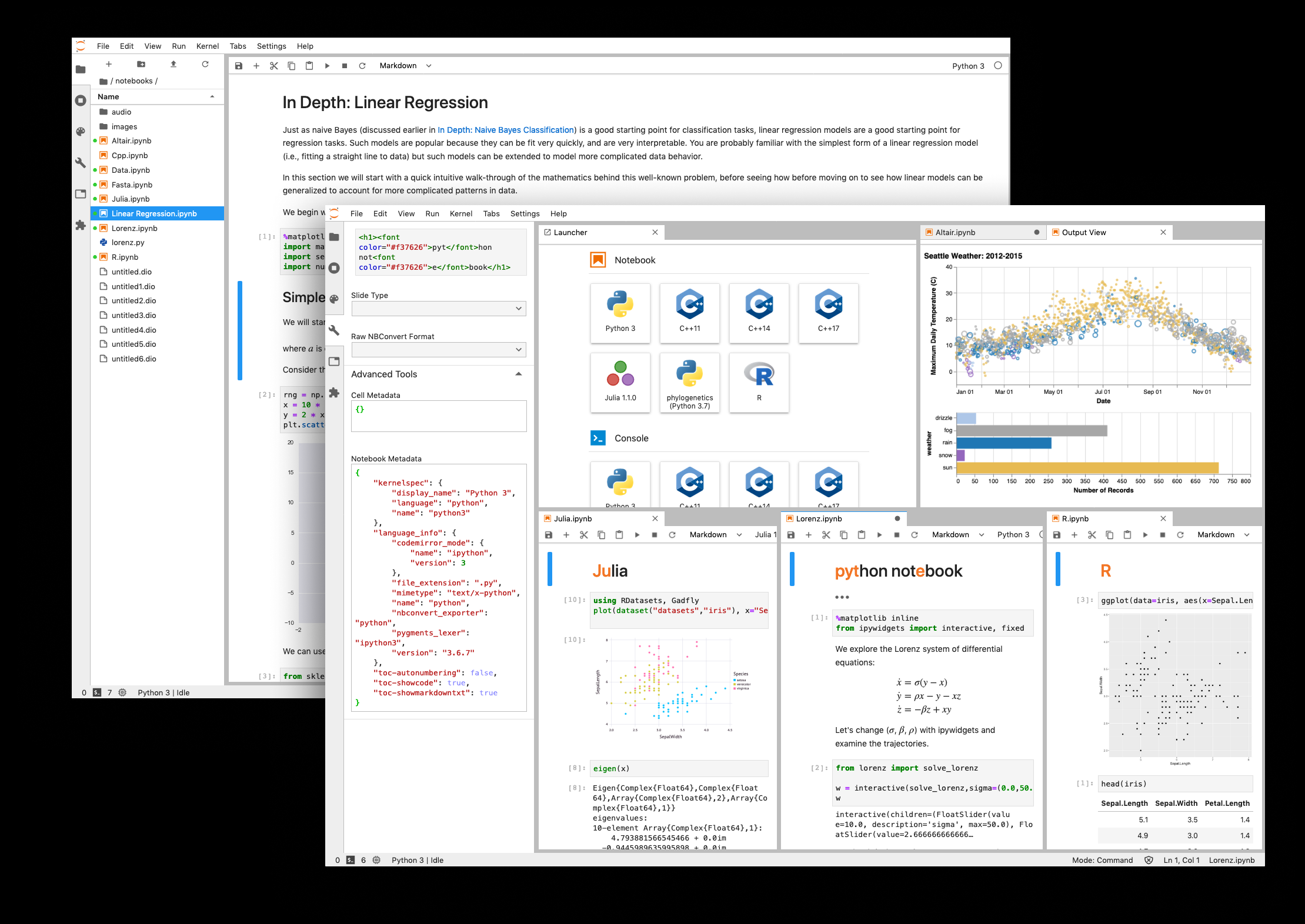
Data science notebooks such as Juypter (shown here) are becoming a popular way to collaborate with data
Data notebooks also have the power and flexibility to address and answer any question, and they offer a means of collaborating on decisions, as well as presenting and sharing these decisions with a wider audience. One hiccup with data notebooks is that they still exist predominantly within the realm of data scientists. Their success as a successor to the data dashboard rests on finding a way to extend their utility beyond data science – becoming equally accessible to a broader user base.
What About Digital Twins?
Data doesn’t get much more visual than in the form of a digital twin. They represent the bridge between the physical world and the digital one, a perfect replica. The capabilities of digital twins are growing, and by their very nature, they require vast amounts of data from across the entire operation.
A digital twin allows you to understand what’s happening in almost real-time, predict outcomes more accurately, run analytical queries – for example with a data notebook – and make decisions that can optimize just about anything. Digital twin may well be the ultimate expression of complete data contextualization.
As our sensors get better and our computing infrastructure grows more capable, digital twins are becoming more accessible for the masses. According to analyst firm IDC, 2022 will be a big year for digital twins. They project that within next year, they will be integrated in 40% of IoT platform vendors’ offerings, and 70% of manufacturers will have adopted this technology.

(Pop Paul-Catalin/Shutterstock)
Don’t Hold a Funeral for Your Data Dashboard Just Yet
While the data dashboard alternatives are viable and hold great potential, we can’t let them meet their demise just yet. These dashboards remain a useful first step towards establishing more data-driven operations – but they’ve reached their limit in terms of potential.
In fact, BI tools on average reach only 25% of the average organization, and within that 25%, most users say they use the dashboard once or twice per week. This limited usage is due to the required manual search for changes in the data, as the dashboard doesn’t alert and generate insights relevant to them.
As organizations grow in data maturity and data literacy, so will their demands for their analytics tools (and the accessibility of those tools for all). And as you feed IT/OT systems with more data, you can expect better-trained algorithms and deeper insights into company shortcomings and achievements.
Pairing this rich data with new visualization techniques will mark a new era of augmented, automated, and modern analytics tools – tools that ensure everyone has access to deeper insights to make better decisions. Regardless of your preference of dashboarding 2.0 alternatives – data stories, data notebooks, or digital twins – you will need to solve for data contextualization to get there.
 About the author: Petteri Vainikka is the vice president of product marketing at Cognite, a Norwegian provider of software for energy, manufacturing, and other assett-heavy industries. Petteri’s professional career spans across enterprise SaaS technologies, where he has found himself at the intersection of emerging transformational technology development and its commercial applications for customers. Prior to Cognite, Petteri worked in senior product management, marketing, sales,
and general management positions for companies such as at Sumea, Rovio, Cxense, and Ardoq. Petteri has a master’s degree in technology from Aalto University in Helsinki.
Related Items:
Augmented Analytics Is the New BI Battle Ground, Gartner Says
ML and BI Are Coming Together, Gartner Says
Leading Solution Providers


