Observable Seeks Democratization of Data Visualization
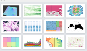
If a picture is worth 1,000 words, then how much is a rich, interactive data visualization worth? If you’re Observable, the San Francisco startup founded by the creator of D3.js and a VP of engineering at Google, then the number starts at 10.5 million.
That’s the dollar amount that Observable brought in last month with a Series A round of funding led by Sequoia Capital and Acrew Capital. But the company’s co-founders–which include CEO Melody Meckfessel (formerly of Google) and CTO Mike Bostock, the D3.js creator–have set their sights much higher than that.
The Observable co-founders recently chatted with Datanami about their new software as a service (SaaS) platform, which is designed to enable teams to work with data and collaborate in a visual environment.
Collaborative Platform
As a platform, Observable supports a range of functionality, from enabling exploring and experimenting with data to creating rich, interactive visualizations complete with animations, as is often done with D3.js. It’s not a code-free environment, as users must know JavaScript (although knowledge of D3.js is not required). As users input and clean their data and write JavaScript code, their data visualizations execute in the browser, in real-time.
Observable is designed to bring a wide range of users, from expert data visualization creators and data scientists to business analysts and novice developers, together in a collaborative environment. That big-tent approach is necessary due to the expansive nature of the data work that Observable is undertaking, says Bostock, who previously was a graphics editor at The New York Times.
“If you think about the data analysis process, you start with finding data, transforming it, cleaning it up, getting it into a form you can use. Then you’re going to do those early exploratory visualizations to figure out if there’s anything interesting there,” he says.
“Eventually, you’re going to want to communicate that to other people, and it’s that community of insight that really has impact,” he continues. “It goes from an idea that’s just in your head to an idea that’s shared by the entire organization. We want this seamless process to support the entire thing, so that when you find something interesting, you can easily share it with the rest of your team, or even the wider world.”
Git Your Viz
The core Observable runtime is free and open source, while the notebook component, where people interact with data, is free but not open source. Users can now access Observable directly from their own Web browsers, and use it to work with their own private data. Customers who want more capability and the ability to collaborate with others can get access to the enterprise SaaS version of ObservableHQ, which is proprietary and not free.
Having these usability options make Observable accessible to a broad group of folks, from mainstream data analysts to hobbyists, and even data journalists. All of these groups are struggling to better grasp the meaning of big data, Meckfessel says.
“Observable was built on the premise that data is overwhelming us,” she says. “It’s everywhere. It’s a problem that everyone is faced with, regardless of what part of the industry you’re in. And the way humans have greater insight into data is by using visualization.”
Observable seeks to be the GitHub for data visualization–simultaneously a repository and a community for folks interested in seeing more in their data, Bostock says. The ability for people to actually see the code behind the data visualization is critical for transparently understanding the assumptions that go into a given visualization.
“What GitHub bought for open-source development, we’re trying to do for data visualization and data analysis,” he says. “The really cool thing is, because we’re supporting the entire process, people who see your analysis or see something you share on Observable, they can immediately dive into how that analysis was done and maybe tweak some of the assumptions, tweak some of the design aspects. So we’re seeing a lot of interesting work, people riffing on each other’s designs, critiquing them, that sort of thing.”
Out of the Box
Observable clearly isn’t the first visualization tool around. Many users are quite fond of their current tools, whether they’re open source like D3.js or have names like Tableau, Looker, Qlik, or PowerBI. While those BI tools bring powerful visualization capabilities to the user, they’re constraining users, Meckfessel says.
“When you use one of those tools, there extremely powerful, but you’re kind of in a box,” she says. “There are constraints. You have templates that you work from. You have pre-canned formulas. You can get somebody up and running in it. But if you need to go out of that box and do something that is more complex and more interactive with the data, you hit a wall.”
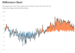
Visualizations in Observable are interactive (unlike this static image) and the code is available with a few clicks (Image courtesy Observable)
Most of Observable’s current customers already use tools like Tableau or Looker, Meckfessel says. But many of them resort to writing custom code when they find something that their BI viz tool can’t support. That’s what’s driving customers to use Observable, she says.
“When they hit the wall, they’re using Observable as a way to do more of the exploratory and the sort of real time rapid data exploration, and then be able pull from the examples we have in the platform to get to that visualization,” Meckfessel says.
Observable is based in large part on D3, but it’s separate, Bostock says.
“Because of our history with D3, a lot of the work that gets done in Observable is D3,” he says. “But Observable itself is not specific to D3. You can use any JavaScript library. D3 is more more tailored to a bespoke, high-cost visualization. If you want to do faster exploratory visualization, there are other tools, such as Vega-Lite and some that we’re contributing to ourselves, that are more focused on fast exploratory visualization.”
Animating Data
Observable was founded in 2016 and launched its platform in 2018. Today, there are hundreds of thousands of users around the world, including paying customers. The New York Times and Chicago Reporter are using the software to help it communicate data about the COVID-19 pandemic. It has Fortune 500 customers too, and it’s being taught in the classrooms at UC Berkeley, Stanford University, the University of Washington, MIT, and Brown, Meckfessel says.
The interactive nature of the Observable notebook is one of the key aspects that makes it so useful, Bostock says.
“We’re more focused on doing stuff interactively, 60-frames per second kind of thing, which is why we have a browser based architecture, rather than doing everything in a remote kernel,” Bostock says.
Data visualizations are more popular now, which is good, Bostock says. But the nature of those visualizations–screenshots and static charts that can’t be played with or opened up in any way—is not good.
“Not only does that miss out on hugely more powerful techniques in terms of using interaction and animation to surface more interesting or more detailed information, but you’re also missing out on the process of how that visualization was made,” he says. “We think that by surfacing the analysis process, people will have a better understanding of how these visualizations and decision were made and be able to particulate and derive new analysis as well.”
It would seem that this approach has struck a nerve. The testimonial of Observable users on the company’s website reflects a fanbase that is quite receptive of the company’s approach. One enthusiastic user called Observable the “brilliant lovechild of @glitch and @ProjectJupyter,” while another observed that, if her mother knew how much time she was spending in the product, then “she’s going to abandon her dream of grandchildren once and for all.”
“We have this dream: Everyone is part data scientist, everyone is part data explorer and visualizer,” Meckfessel says. “The barrier to entry is JavaScript. There’s learning that has to happen there. But if we can make it easier with better learning, resources, tutorials, and amazing sets of examples from the libraries that folks can borrow from, then you don’t have to carry that workload.”
Related Items:
Best Practices for Data Visualizations
Study Shows How Workflow Visualization Can Enable Big Data Transformation
What Color Is Your Data? Inside the Science of Data Visualization
Editor’s note: This article has been corrected. The notebook component of Observable is not open source. Datanami regrets the error.
