


October 8, 2020
Qlik Launches Presidential Debate Analytics Tool
Even if you’ve been watching the presidential debates, you may have come away asking yourself: what were they even saying? In the cacophony of controversies, interruptions, and shouting, it can be difficult to discern what candidates are emphasizing with their words. Now, enterprise analytics firm Qlik has introduced a new, free analytics tool that quite literally allows users to analyze the candidates’ language, offering an interactive visual exploration of the words used in debates dating from the 1980s to the last week. The app also aggregates and analyzes media coverage of the presidential and vice presidential candidates, comparing air time by network across the political field.
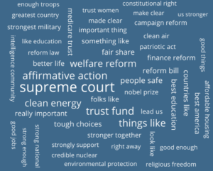
Qlik‘s debate dashboard focuses on counting the frequencies of any given word across debates, pulling its information from the transcripts of each face-off. All results are parsed by party, and the two main views are presented as word clouds and bar charts. Users might peruse the bar charts to see most-used words overall (relatively mundane results like people, country, and america) or use the word clouds to see the most popular distinct words used by each party: “health,” “families,” “insurance,” and “education” feature for Democrats, while Republicans tend to emphasize “government,” “taxes,” “federal,” and “percent.”
Users can even drill down into a specific debate: the September 29th presidential debate, for instance, featured lots of mentions of “vote,” “fact,” and deal,” from Vice President Joe Biden, while President Trump focused on words like “left,” “dollars,” and “military.” Beyond specifying a debate, users can specify sentiments (positive, negative, and/or neutral), topics (e.g. domestic policy or immigration), part of speech (e.g. adjective or verb), and the number of words in a phrase (one, two, and/or three). For instance, the most common positive-sentiment two-word phrases on immigration used by Democrats and Republicans in debates since 1980 are, respectively, “immigration reform” and “strong borders.”
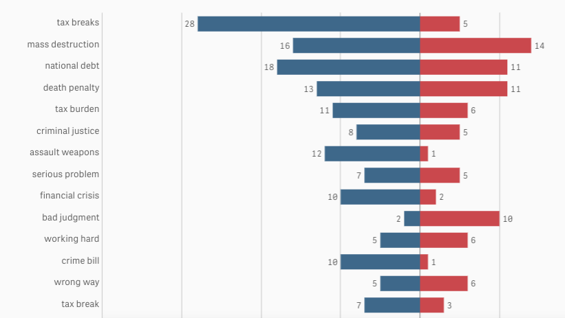
The most frequently used two-word negative-sentiment phrases from presidential debates, 1980-present.
The coverage dashboard, meanwhile, pulls its data from the Internet Archive’s Television News Archive, which Qlik says “records how many times each U.S. Presidential candidate was mentioned on a major television network.” The app is updated twice a day using Qlik Sense, offering charts of candidate coverage broken down by network over time. Users can filter by international or national news and even highlight key campaign events on the line graph showing net coverage over time – the Democratic National Convention, for instance, shows that the Democratic candidates received a notable bump in coverage.

Net coverage by party during the current election cycle.
To tinker with Qlik’s 2020 Presidential Election dashboard yourself, click here.
Applications:
Research Analytics
Vendors:
Qlik
Leading Solution Providers


