


November 7, 2016
8 Interactive Visualizations for Election Day

Election Day is upon us, marking an end to a memorable and data-rich political campaign season. As the returns roll in, you’ll want to use these eight interactive data visualizations to track the news and sentiment expressed by an expected 130 million voters.
This year’s presidential campaign has provided ample fodder for advanced analytics and data visualizations. From sentiment analysis of Twitter and Facebook posts to electoral college forecasts based on the latest polling data, you could say we live in a target-rich environment for data-hungry algorithms and interactive visualizations.
Here are eight data visualizations that will help tell the story as the events of Election Day unfold tomorrow:
FiveThirtyEight
Nate Silver took statistical analysis of political races to a new level with FiveThirtyEight, which refers to the number of electrical college votes that are available in the presidential election. The website provides an array of data visualizations that track a bevy of political contests, not the least of which is the presidential election.
FiveThirtyEight’s 2016 Election Forecast lets you slice and dice its predictions in multiple ways, including a Polls-Only forecast (which pulls data from opinion surveys), a “Polls-plus forecast” (which adds Silver’s unique statistical methodology to the mix), and a Now-cast that predicts who would win if the election were held today.
FiveThirtyEight has taken data visualization to a new level with political campaigns, which is why it’s required reading for data enthusiasts this Election Day. You can view the vizes at www.538.com.
Alteryx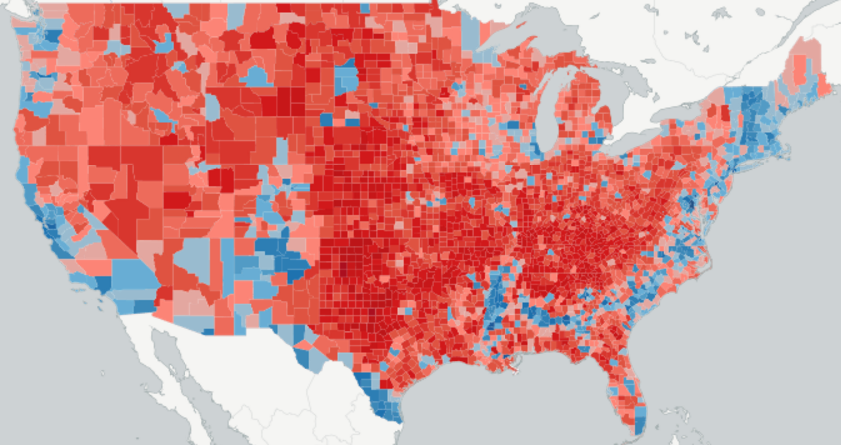
Alteryx developed a presidential electoral app that attempts to predict the winning candidate within a variety of micro demographic areas. The app, which pulls data from seven different data sources, also reveals sentiment differences in specific neighborhoods by age, education, gender, and race.
What makes the app so compelling is how it mixes detailed geographic data with advanced analytics. It lets users see how their preferences for different candidates tends to shift as demographics change. In terms of visualizing the raw ingredients of political science, this app is hard to beat. Click here to view the app.
Qlik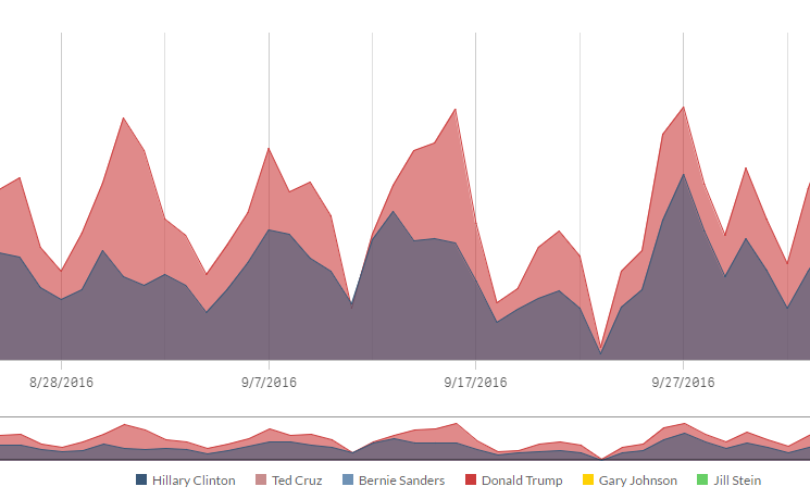
For its election app, Qlik aimed to do one thing, and do it well: Track the number of times each presidential candidate has been mentioned across major TV networks.
The viz, dubbed “Who’s Being Talked About?” shows the user how often Donald Trump and Hillary Clinton have been mentioned across networks like CNBC, Bloomberg, Fox News, and MSNBC. Users can populate the viz by selecting any of six candidates for president during any period of time from January 1 2015 through today.
To build the app, Qlik loads its associative database with archived data that the networks make availed every 24 hours. The viz is clickable, and allows the user to display only mentions made by particular candidates on certain networks. You can check out the app here: webapps.qlik.com/presidential-election-2016/index.html.
Tableau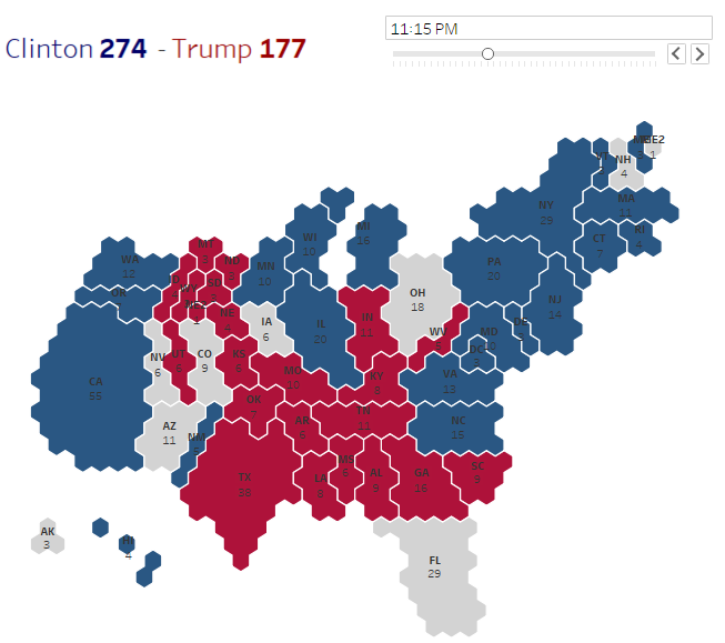
Tableau Software offers a host of visualizations that allow users to explore various aspects of the presidential and senate races. The company also employs predictive models, dubbed Aggregators Ensemble, to provide forecasts for who is likely to win each state.
You can also explore how various metrics, like gender, salary, education level, city, and what industry a person works in, is likely to impact the election. As if all that wasn’t enough, the analytics software company also provides vizes that track presidential endorsements by newspapers over the past 36 years, how the candidates rank in the Flesch Reading Ease index, how campaign distributions have flowed, and how approval ratings have moved for every president since Franklin D. Roosevelt. You can take it all in at www.tableau.com/election2016.
Graphiq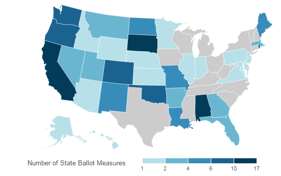
You’ll be able to sort and view details about the presidential candidates to your heart’s content at Graphiq, which powers visualizations used by a number of media outlets. Interested in how Donald Trump’s tax plan will impact your taxes? Graphiq has an answer.
Graphiq, which also powers the visualizations at www.insidegov.com, has even delved into the complex world of state ballot measures, and allows the user to sort state ballot measure by type (i.e. regulation of firearms, alcohol, death penalty, etc.). You can access a range of election-related visualizations here. For real-time results on November 8, see its 2016 General Election Dashboard.
MemSQL
MemSQL will be running a real-time sentiment analysis project for Twitter posts this Election Day. The system will showcase how big data technologies like Apache Kafka, machine learning algorithms, and MemSQL’s own relational, in-memory database can be used to surface insights on fast-moving social media data.
Considering what a battleground Twitter has been and the war of words between Hillary Clinton and Donald Trump, this live demo could turn out to be an interesting visualization to check out as the returns come in. You can view it on November 8 at election.memsql.com.
ETX
The result of the U.S. Presidential Election is widely expected to have a big impact on the movement of capital markets. To help traders capitalize on the expected movements in equities, the folks at British brokerage house ETX have devised visualizations to help them better understand the outcome.
ETX’s US Election Barometer measures the quality, quantity and tone of media mentions of the presidential candidates on a daily basis. It lets “traders easily monitor the avalanche of media opinions in real time, giving them a valuable edge in their trading decisions.” The visualization is not free, but it gives you an idea on the type of edge traders are looking for.
Zoic Labs
Zoic Labs will be using big data analytics tools and techniques to track “voter emotion” on November 8. The “LIVE by Zoic” visualization will specifically look at voter sentiment expressed on Twitter, which is expecting to see traffic spike to record levels.
“This isn’t polling data,” says Biz Stone, who sits on Zoic Labs advisory board and is a co-founder of Twitter. “It’s real people, expressing their real thoughts and it’s the closest we’ll get to having a crystal ball.”
The visualization, which will use tools developed by Zoic Studios and the LUX2016 analytic suite from ICG, will be accessible November 8 at live.zoiclabs.com.
Technologies:
Middleware
Sectors:
Government
Leading Solution Providers


