
October 19, 2021
How Data Visualization Drives Better Business Decisions and Outcomes

(ArtHea/Shutterstock)
I’ve run software development teams (some with more than 1,000 members) over the past 25 years. The software development discipline has exploded in growth due to the need for technology support across all aspects of business. Despite this growth, the core challenge remains the same: in order to be effective, technical teams need to find ways to make better decisions, faster. Teams need to see and think about their work differently.
Developer teams riff and iterate on code. Iteration is the key because no matter how sure they are of what they are building, they inevitably have to change and evolve it during the creation process. But all that code is built with–and generates–enormous amounts of data. What is exciting is that data can provide insights into how and why software is used (or not). From understanding dependencies to identifying hot spots, developers can learn a lot from visualizing their software.
Think and See Differently
Web, mobile, data visualization, application development are often thought of as distinct because the languages and frameworks are often distinct. While most people consider data visualization and software development to be distant relatives, I maintain that it is incredibly difficult to decouple the act of writing the software from the actual data needed to input, access, process, and ultimately use to gain valuable insights.
I’ve seen time and again that data visualization guides us through the tangle of software development by tapping into the power of human visual processing, literally using our visual system to deepen our understanding. It improves our confidence because we gain the ability to “see” trends and discover surprises in data. It also helps teams more easily and intuitively build, explore and communicate with wider teams of data scientists, executives or analysts.
This benefits software developers and their co-workers in three key ways:
- Communicating value. Developers have strong opinions and care about outcomes – it is important to demonstrate the value of the software created.
- Making better decisions. Data helps us think. We use data to ask questions, identify patterns, and make better decisions. The ability to more collaboratively use data to make decisions will only accelerate this.
- Finding new insights. Data is the foundation of most things in our connected world. Immediate feedback helps us learn and more quickly move on to the next job to get done.
Development teams treat dataviz just like any other software development. From prototyping to publishing in production, software developers are iterating on data visualizations quickly to improve and reduce costs and time-to-market of data insights. Teams curate data from diverse sources, consolidate and analyze it, and then create advanced visualizations and dashboards to inform and work collaboratively with their teammates. Visualizing our code drastically improved our understanding, minimizing risk and revealing insights to improve our software. Otherwise we’d be stuck using the following:

Source: xkcd.com
Visualization: Exploration and Explanation
Exploring the world was difficult and dangerous before charts and maps were available. For centuries we’ve relied on charts, maps, and graphs to make sense of the world. Why not use the same tools, in the form of data visualizations, to help us understand and communicate the value of our code at a deeper level?
Visualizing data typically takes two forms: you either create dataviz for yourself (exploratory) or you create it with the goal of educating or sharing insights with others (explanatory).
Exploratory data visualization helps us better understand and explore code hierarchies with dataviz like the radial tidy tree below.
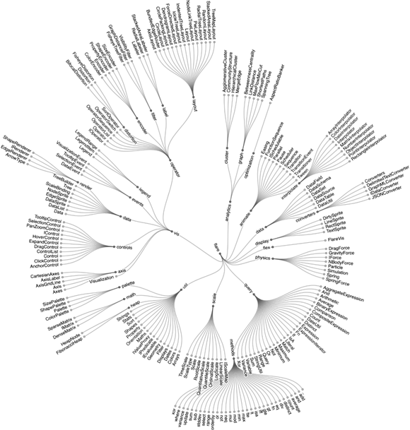
Source: Observable
Explanatory data visualization helps us explain what is happening with the systems we build. The example below reveals HTTP status logs. We can use visualizations like this to explain important events like post-mortems as well.
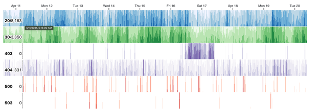
Source: Observable
When teams interact with code, data, and visualizations together, work becomes more transparent. Transparency minimizes risk by connecting both developers and data practitioners directly to the data and logic so that everyone is better informed throughout the entire process. When more people with diverse skills work together, more and more people can learn from each other. The more approachable, interactive, transparent and shareable dataviz becomes, the more quickly we can attain those insights together.
Creativity and Innovation Happen When Everyone Works Together
Teams design and prototype together. They write code and tests together. They deploy (and rollback) together. They respond to incidents together. And they do it all over again, iterating and evolving the software… together.
The explosive growth of software in the past few decades mirrors the success and adoption of open source and the Internet: the ability for anyone, anywhere, to share and learn from each other. To make the most out of the power that data-driven insights offer, we must enable everyone to collaborate, not just the experts. Working with data is an essential skill for everyone and it will only become more urgent as the volume of data that we rely on today pushes the limits of human understanding. 
About the author: Melody Meckfessel is the CEO and co-founder of Observable, bringing the power of visualization and data analysis to the world’s developers. Melody is a hands-on technology leader with more than 20 years experience building and maintaining large-scale distributed systems and solving problems at scale. Before co-founding Observable, Melody was a vice president of engineering at Google, where she led DevOps for Google including Google’s Cloud Platform’s tools and systems, with a global team of engineers. She has a degree form UC Berkeley.
Related Items:
Observable Seeks Democratization of Data Visualization
Best Practices for Data Visualizations
What Color Is Your Data? Inside the Science of Data Visualization
Leading Solution Providers


Tabor Network
Sponsored Multimedia


Featured Events
-
Call & Contact Center Expo
 April 24 - April 25Las Vegas NV United States
 -
AI & Big Data Expo North America 2024
 June 5 - June 6Santa Clara CA United States
 -
AI Hardware & Edge AI Summit 2024
 September 10 - September 12San Jose CA United States
 -
CDAO Government 2024
 September 18 - September 19Washington DC United States