

October 27, 2020
Data Visualization Delivers a Full Moon

Data visualization and the organization of information in multiple formats from pixels to text has been used to develop a compelling website that presents in extraordinary detail the first human exploration of our moon.
The Apollo in Real Time website is the award-winning work of Ben Feist, a NASA data visualization and informatics specialist. The site includes comprehensive, multimedia accounts of the first and last American moon landings as well as the ill-fated flight of Apollo 13 in April 1970.
Feist described his years of labor on the website in a recent presentation to the Explorers Club. Travis Steffens, a regional director of the organization, said the Project Apollo site represents “what I thought the internet should have been when internet started.”
Feist, a software engineer by training who currently works for NASA’s Astromaterials Research and Exploration Science Division, launched the project in his spare time, First, he gathered, corrected and prepped all available historical material, including audio and video transmissions, still images and data from Apollo lunar surface experiments that collected data on lunar samples, seismic and heat flow data, even gravimeter readings.
“It was an exercise in taking all the historical material and digitizing it,” Feist said.

NASA’s Ben Feist
His first and most ambitious project was the Apollo 17 mission, during which two astronauts spent three days on the surface, traveling more than 20 miles from one station to the next in a lunar rover. The foundational data set for the project was the mission transcript. The key was “coming up with a way to make the transcript [to] be a way-finder for the entire mission,” he noted.
As with many enterprise data sets, Apollo 17 data was siloed into photo galleries, audio and film and video files. “I was looking for a way to tie this all together.”
Feist ultimately made the mission transcript the project’s keystone, incorporating time-series still and film imagery.
The corrected, 2,700-page transcript was “the common denominator, what is common among all these media types and it ties it all together” to present in detail how the mission unfolded from launch preparations to splashdown and recovery.
It took Feist five long years to pull it all together, working nights and weekends as a way to “unwind [and] recharge” from his day job.
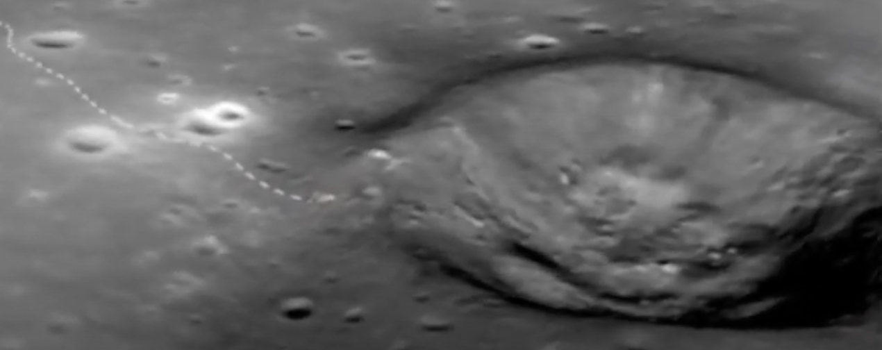
He next approached the managers of NASA’s Lunar Reconnaissance Orbiter (LRO) to obtain high-resolution images of the Apollo 17 landing site, a mountainous region in the southeastern edge of Mare Serenitatis known as the Taurus-Littrow valley.
Feist converted satellite mapping data into a “giant texture” map used to show the crews’ route over three days of exploration in December 1972. The texture was created using imagery from LRO’s different orbital planes, then inferring from the different parallax perspectives the 3D structure of the valley surface.

Adding LRO photography, Feist then recreated a 3D model of the lunar valley, depicting the precise location where Challenger, the Apollo 17 lunar module, touched down on Dec. 11, 1972.
Images of the lunar module and rover were scaled using models. Feist said he labored to ensure the LM footpads corresponded with the landing site and the rover’s wheels fit the tire tracks left on the surface.
A house-full of computers were than ganged to create a “render farm,” animating the landing site frame-by-frame. The result was a faithful rendering of every crater, hill, scarp, striation and mountainside in a lunar valley deeper than the Grand Canyon.
As did the Apollo astronauts, Feist pressed on to the next hill. Once the animation was completed, the visualization specialist moved beyond mere lunar map-making to depict the entire Apollo 17—and later Apollo 11 and 13—missions.
After several years of toil, really a labor of love, Feist realized, “I had no idea of the grandeur of the human exploration that had occurred, and the kind of place these people were in.”
Thus inspired, he retrieved the routes the Apollo 17 lunar rover travelled across the majestic valley. Mapping data turned out to be fairly rudimentary and full of educated guesses about the actual routes. Feist thinks he was able to refine those preliminary estimates using traverse photos taken between station stops. The output compared actual photos to Feist’s 3D model of the landing site.
Once the horizons in his 3D model matched the traverse photos, he concluded, “At least I knew I was using the LRO data right, and I’d done that part correct.” He synched the matched images with the mission transcript to calculate the rover’s likely route.
“It all [became] a virtuous circle that allowed you to recreate the traverses.”
Source: Ben Feist/Apollo in Real Time
Among the final steps in the visualization process—and Feist’s attempt to make the Apollo project accessible beyond a devoted audience of space geeks—was the creation an aerial view of the lunar rover’s path, complete with dotted lines indicating the rover’s progress. He then mixed in communications between the astronaut explorers and ground controllers, giving viewers something to look at and listen to between stations stops when the rover’s camera was turned off.
The results are, well, out of this world. “It’s the coolest website I’ve ever seen,” said Steffens of the Explorers Club.
Feist is currently using his data visualization skills at NASA to help astronauts return to the moon.
The results of Feist’s data organizing and visualization efforts for the Apollo 17 moon landing are here, beginning one minute before a spectacular nighttime launch, all the way to Taurus-Littrow and back.
Technologies:
Frameworks
Leading Solution Providers


Tabor Network
Sponsored Multimedia


Featured Events
-
Call & Contact Center Expo
 April 24 - April 25Las Vegas NV United States
 -
AI & Big Data Expo North America 2024
 June 5 - June 6Santa Clara CA United States
 -
AI Hardware & Edge AI Summit 2024
 September 10 - September 12San Jose CA United States
 -
CDAO Government 2024
 September 18 - September 19Washington DC United States