
October 23, 2015
The Art of Analytics, Or What the Green-Haired People Can Teach Us

It’s been said that a picture is worth a thousand words. But in this big data age, perhaps we should say that a picture is worth 1,000 terabytes. This week Teradata showcased some of the ways that the creatives among us, or the “green-haired people,” are putting data to pixel with an installation dubbed the Art of Analytics.
Teradata put more than two dozen visualizations on display at its user conference this week in Anaheim, California. The big, bold displays, which are also available for viewing online, were generated from real-world data using its Teradata Database and Aster Analytics technology, and show that data visualizations can be an art form.
“Great insights are more than science,” say the curators, Tony Ohlsson, head of financial services for Teradata’s Asia Pacific Japan group; Alexander Heidl, an idea incubator at Teradata GmbH; and Chris Hillman, a principal data scientist with Teradata International. “They are an art form. Successful companies must create a culture of creativity. We need to treasure the ‘green haired’ people.”
For example, the visualization in the upper left of this page, titled “Funding Fountains,” charts the money flows between large Chinese companies, conducted as part of a risk analysis by a large Chinese bank. According to the chart’s creator, Qiling (Mary) Shi–a data scientist in Teradata China’s Aster & Hadoop Big Data Center of Excellence–the 3,883 dots (or nodes) represent the companies, while the 3,943 lines (or edges) represent an individual transfer of funds in excess of about $115,000.

Courtesy of Kailash Purang, Teradata
“To manage risk, the bank can identify any large exposure concentrations to groups of highly interdependent companies, where a single failure may bring down all the companies,” Qiling writes. In total, Qiling utilized nearly 61 million records across 670,000 companies, and organized the data using the PageRank algorithm in Aster. Showing the data in this manner utilizes the human brain’s ability to quickly pick up on patterns in a much more intuitive manner than, say, representing the data as tables of numbers in a spreadsheet.
Connoisseurs of high-end whisky may be interested in “Single Malt Sampler,” created by Kailash Purang, the lead data scientist for Teradata in Singapore. Purang used a Gephi representation of an Aster Lens to crunch a modest set of open data from the University Of Strathclyde’s Whisky Classification program. He grouped 86 single malt brands into 12 flavor groups, characterized by features like sweetness, smokiness, honey, and nutty.
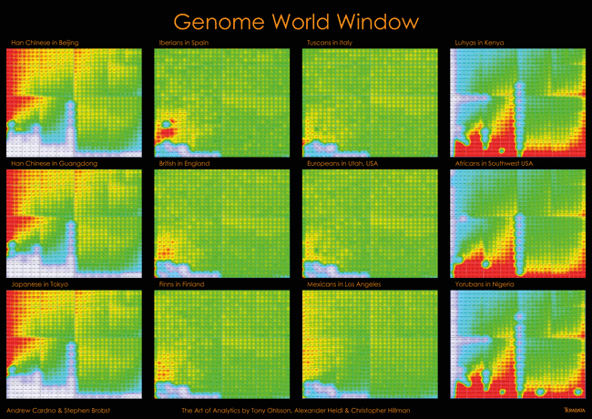
Courtesy Andrew Cardno and Stephen Brobst, Teradata
Genetic variability was the theme of another visualization, dubbed “Genome World Window.” This heat map depicts genetic variations (and similarities)
across multiple human populations and geographies using data from the 1000 Genomes Project. Created by Andrew Cardno, the CTO for VizExplorer and Teradata CEO Stephen Brobst, the visualization shows a collection of Quartal Super Graphics created by VizExplorer sitting on top of the Teradata Database.

Courtesy Chris Hillman, Teradata
In “Stars and Stripes,” Teradata’s Chris Hillman uses various Aster engines to show the linkage between drugs in clinical trials and their negative side effects.
The large dots (nodes) that form the points of the star represent a drug prescribed to patients, while the nodes in the center show unwanted side effects. Crunching all this data, which was downloaded from www.clinicaltrials.gov, involved multiple steps, including using Aster’s MapReduce function, text mining to extract side effect names, and finally the graphing function.
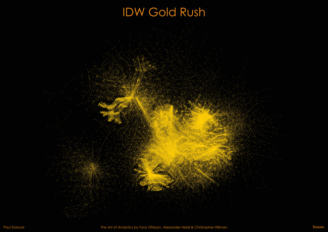
Courtesy Paul Dancer, Teradata
In “IDW Gold Rush,” the acclaimed “metadata scientist” Paul Dancer turned big data technology upon itself by showing how a large and mature integrated data warehouse (IDW) looks through a metadata lens. Dancer, who is an architecture consultant at Teradata, used dots (nodes) to show individual database objects in a Teradata IDW and used lines (edges) show their dependencies on each other. “The large dense mass is the central, integrated data structure and the outer islands are marts,” Dancer writes. “It allows us to see all the interdependencies and the sequencing of all of those tiny processing chains. It is the ultimate tool to optimize an IDW!”

Courtesy Yasmeen Ahmad, Teradata
Finding financial fraud in the insurance business is the focus of “Trapping Anomalies,” a visualization put together by Teradata’s Yasmeen Ahmad. In her work, the nodes represent quotes that are created by brokers using the insurance company’s platform, while the links between the nodes indicate quotes that are associated.
“Typical broker behavior indicates that once a broker has generated a quote, it would only be accessed and refreshed if the quote lifespan ends before a customer has taken a decision to accept the quote,” she writes. “The two clusters in the centre (bluish) depict anomalous behavior, where a broker is continuously returning and refreshing the same quote after changing a small number of attributes on that quote.” That’s an indication that the broker is gaming the insurer’s system in an attempt to determine how the pricing engine works, she writes. The finding was not expected.

Courtesy Karthik Guruswamy, Teradata
Finally, in “Air Nebula,” Teradata consultant Karthik Guruswamy depicts the 60,000 flights that have occurred between more than 3,000 airports since January 2012. To create the graph, Guruswamy crunched the flight data (culled from www.openflights.org) using the collaborative filtering algorithm, which demonstrates the co-occurrences of items within a context.
“The Sigma graph based data visualization shows airline carrier similarity measured by the common cities they serve,” Guruswamy writes. “The nodes or circles in the graph are the airline carriers and the edge thickness and proximity of the nodes are indicative of the degree of similarity. The thicker the edge and closer the nodes, the more cities the carriers serve in common.”
Clearly data visualization has come a long way from the days of black-and-white pie charts and pokey line graphs. As these visualizations show, the combination of data science rigor, green-haired creativity, and advanced technology can turn big, messy data into something that’s not only fascinating to look at, but that also provides intrinsic value to the company or organization behind them.
Related Items:
A Virtual Reality Lens for Big Data Visualization
What Color Is Your Data? Inside the Science of Data Visualizatio
Using Visualization to Unlock Secrets in Big Data
Technologies:
Middleware
Vendors:
Teradata
Leading Solution Providers


Tabor Network
Sponsored Multimedia


Featured Events
-
Call & Contact Center Expo
 April 24 - April 25Las Vegas NV United States
 -
AI & Big Data Expo North America 2024
 June 5 - June 6Santa Clara CA United States
 -
AI Hardware & Edge AI Summit 2024
 September 10 - September 12San Jose CA United States
 -
CDAO Government 2024
 September 18 - September 19Washington DC United States