

December 10, 2013
Birst Knows Best for Data Visualization
Regular business folk who have trouble operating today’s high-powered data visualization tools are the targets for a new offering unveiled today by Birst. Called Birst Visualizer, the product employs a guided approach to data discovery that picks a visualization for the user based on basic search terms, and then automatically populates it with the pertinent business data.
![]() Birst Visualizer is the company’s first foray into the world of data visualization tools, which have already solidified themselves spots in the big data tool belts of many of the world’s largest companies. But instead of going straight up against giants like Tableau, QlikView, or TIBCO Spotfire, Birst wisely chose to attack the problem from a different angle, which is the guided approach.
Birst Visualizer is the company’s first foray into the world of data visualization tools, which have already solidified themselves spots in the big data tool belts of many of the world’s largest companies. But instead of going straight up against giants like Tableau, QlikView, or TIBCO Spotfire, Birst wisely chose to attack the problem from a different angle, which is the guided approach.
Users begin interacting with new software using a simple Google-like query interface. A sales manager can start typing “sales for Califor…” and before she’s even done typing, Birst Analyzer will automatically rummage through the database, pull up the most recent sales data for California, and pop it into a bar chart. It’s a novel approach, and one that could possibly garner the fast-growing San Francisco company another big burst of sales of its own.
There are about 25 different visualizations in the first release of software, ranging from basic bar and line charts to maps and trellises to colored bubbles. The software picks the visualization that it thinks best matches the query. For example, if there’s a time element or a spatial element to a question, it will suggest a time plot or a map visualization.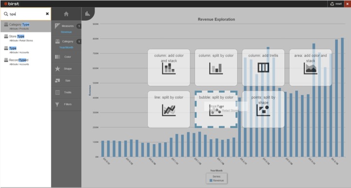
Birst isn’t going to win many deals against Tableau or QlikTech based on the number of visualizations in the software. But that’s missing the point, says Birst vice president of product strategy Southard Jones. “I’m more interested in the speed to an accurate answer,” he says. “I don’t care if they have 50 visualizations. But if you don’t get the right answer in a short amount of time, it doesn’t matter how many visualizations you have.”
The software is Birst’s response to the shortage of employees in the workplace with the advanced technical expertise to work with data in a sophisticated way. The Harvard Business Review dubbed data scientist the “the sexiest job of the 21st century,” but it might as well have called it “the most difficult job to fill in the 21st century.”
Call it the common man’s approach to data analytics. “We’re not targeting that person who’s a data analyst or a data artist,” Jones tells Datanami. “We’re targeting somebody like myself, a product manager. We’re targeting the marketing manager at TD Ameritrade, the guy who actually, on a daily basis, needs to explore data, but isn’t a data scientist and wasn’t trained in those skills.”
When you lift the covers off Birst Visualizer, you won’t be stunned by the complexity of the technology. You won’t find Hadoop or a massive graph database or whatever big data technology that makes Google’s auto-complete so eerily accurate. Instead, you’ll find some good old fashion elbow grease, of the UX variety.
“We’re not applying some crazy machine learning algorithm to fit in real time,” Jones says. “What we’ve done instead is spent a ton of energy and time to understand how people interact with data, and we’re baking that into our code.”
Much of that work was subtractive. Birst has observed that many searches are very similar. So instead of requiring people to go through three steps before getting what they want, Birst cut out those steps, and give people what they’re most likely to want.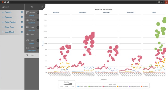
With that said, there are obviously some algorithms at work, since Birst is doing some of the thinking for the user. For instance, the software automatically assumes that, when a user types in “revenue,” that they’re going to want to know what the current period is and perhaps a few previous quarters. “We’re going to make a lot of assumptions for the end users,” Jones says.
Birst developers added buttons to the interface to allow the user to select different data sets when Birst Visualizer uses the wrong data set the first time. They also allow the user to select different visualizations. Of course, Birst also supplies tools to allow people to build their own tools. But the whole point with the visualization tool is to simplify the entire process to the point where it meets the data analysis needs of the broader population.
In addition to the guided approach, Birst is counting on its new visualizer to provide a data scalability advantage against Tableau, et al. Whereas the in-memory tools are restricted to analyzing gigabytes worth of data loaded into the memory of a PC, Birst’s tool can be used against terabytes worth of data that a customer has stored in the Birst database, Jones says.
[Tableau and QlikView] are great tools but they’re desktop tools,” Jones says. “Just like Excel, everybody has a different version of the same file. We have one data store and one visual discovery tool, so everybody working in general across this company is accessing the data—business data not raw data.”
Birst traditionally has used InfoBright’s column-oriented database for its cloud-based offering. The company also sells an appliance version of its software, and recently announced support for using Amazon’s RedShift as the back-end data repository.
Related Items:
Leading Cloud BI Provider Birst Closes $38 Million Funding Round
Birst Grabs Redshift for End-to-End Data Warehousing
Leading Solution Providers


Tabor Network
Sponsored Multimedia


Featured Events
-
Call & Contact Center Expo
 April 24 - April 25Las Vegas NV United States
 -
AI & Big Data Expo North America 2024
 June 5 - June 6Santa Clara CA United States
 -
AI Hardware & Edge AI Summit 2024
 September 10 - September 12San Jose CA United States
 -
CDAO Government 2024
 September 18 - September 19Washington DC United States